Brand Identity
Brand Identity
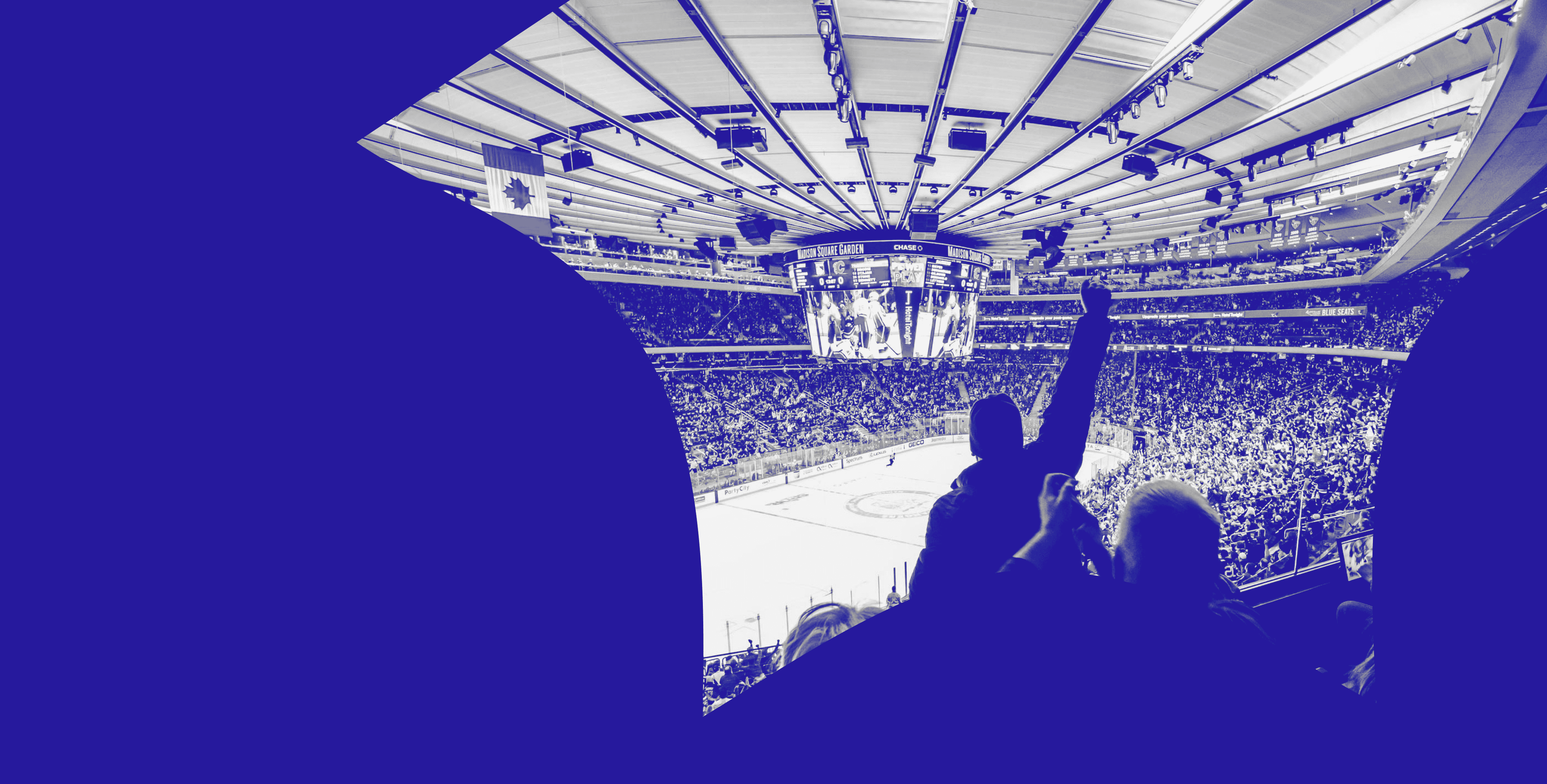
Madison Square Garden has a reputation that is as extensive and grand as the services it provides. The image of such a company should capture the variety of its entertainment services while remaining recognizable and consistent.
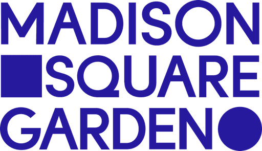
Primary Brand Identity

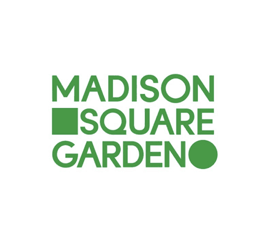
Logo Mark
Brand Typeface: MSG Primary
ABCDEFGHIJKLMNOPQRSTUVWXYZ
abcdefghijklmnopqrstuvwxyz
1234567890@#$%&*( ) “ “ ? /
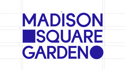
Mark Construction
Following the Design Motif, the brand identity uses the arena’s physical elements to embody MSG’s history and brand journey.
The Square
Represents the first Madison Square Garden.
The Circle
Represents the current Madison Square Garden.
Secondary Lockup
In situations where the primary logo is too large or doesn't fit the space, such as on smaller formats, social media, or in specific marketing materials.

Variation 1
Variation 2
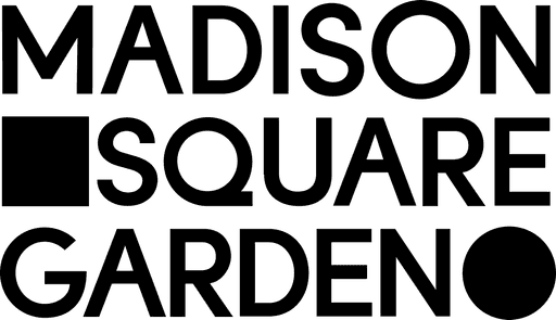
Black and White Logos
Black and white logos are easily adaptable to different backgrounds, print methods, and media, ensuring consistent branding regardless of the context.
Primary Brand Identity

Logo Mark
Primary Brand Identity
Logo Mark
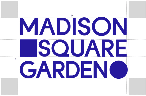
Structure Analysis
To protect the clarity of the logo and ensure it has as much impact as possible, it should be surrounded by an area of space known as the exclusion zone.

The exclusion zone is measured at the same size as the Square.
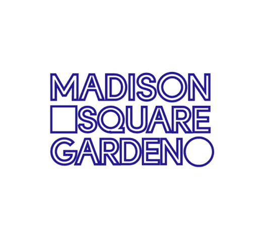
Logo Misusage
There are several ways to not use the logo, including stylistic treatments. This includes but is not limited to (See Image Below):

Refrain from applying visual effects.
Refrain from using gradients, overlays, or other color effects.
Refrain from using outlines and removing the fill.
Do not rearrange the logo elements.
Do not stretch or condense.
Do not change the color of the logo.
Do not alter or change typeface.
Do not rotate the logo in any direction.
No Tilting Logo
No Using Colors Outside of MSG Palette
No Using Outline
No Stretching or compressing

Next: Dynamic System